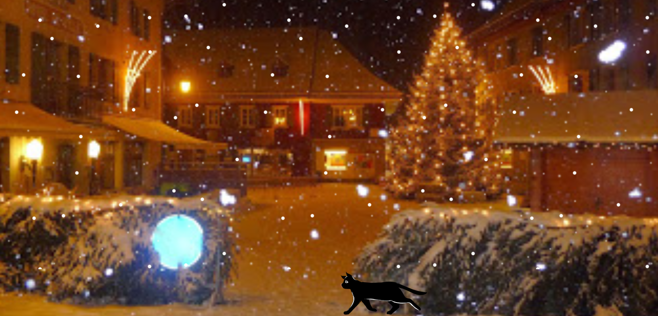
Pure Css Snow fall animation with Cat moving Animation
Merry Christmas!!!
I've never felt the snowfall. But I've seen many movies about Christmas and snow fall. Merry Christmas to all of you. Today I’m going to show some animation of snow fall with cat moving with pure css without any JavaScript. I get help from different blogs to create this demo. The demo is simply of css and use Images to animate and create the animation effect.
Html Body:
The body consists of simple html div with class name. Div falling for snow falling and div tuna for moving cat.
The CSS:
Now to create the effect, we need different images. We need three different snow images of different sizes and focus. Next we need the sprite image of cat to make the cat move. We’ll overlay the images on the top of another to make the effect of moving.
Next thing is to make animation. Here we use keyframe. This is required to make animation of the images.
Final Code
Image source:
Background image: jazzalert[dot]files[dot]wordpress[dot]com/2009/12/cd-snow-night-square.jpg
Moving cat: stash[dot]rachelnabors[dot]com/img/codepen/tuna_sprite.png
Merry Christmas!!!
I've never felt the snowfall. But I've seen many movies about Christmas and snow fall. Merry Christmas to all of you. Today I’m going to show some animation of snow fall with cat moving with pure css without any JavaScript. I get help from different blogs to create this demo. The demo is simply of css and use Images to animate and create the animation effect.
DEMO
Getting StartedHtml Body:
The body consists of simple html div with class name. Div falling for snow falling and div tuna for moving cat.
 <div id='falling-snow' style=" left: 0; top: 0;"> </div>
 <div class="tuna"></div>
The CSS:
Now to create the effect, we need different images. We need three different snow images of different sizes and focus. Next we need the sprite image of cat to make the cat move. We’ll overlay the images on the top of another to make the effect of moving.
 html {text-align: center;}
 body{
 background: url(cd-snow-night-square.jpg) no-repeat center center fixed;
 -webkit-background-size: cover;
  -moz-background-size: cover;
  -o-background-size: cover;
  background-size: cover;
 }
 .tuna {
  background: url(http://stash.rachelnabors.com/img/codepen/tuna_sprite.png) 0 0 no-repeat;
   background-size: 800px auto;
  height: 100px;
  width: 200px;
  top:90%;
 }
 #falling-snow {
 background-image: url(https://blogger.googleusercontent.com/img/b/R29vZ2xl/AVvXsEiV07SflBHj3dkC-B20X2hkgDp2qHmwFIYVjACaSoJccVIIYeW6701CG_lmW4k_a_6l3-mV_FNW_NjqZ_jpFYaZ18f_Go8df15AHJgu5JIEFFuyNubnlPAP-HHp3sGx1n1CZ4j6ZUg5IzQn/s1600/snow.png), url(https://blogger.googleusercontent.com/img/b/R29vZ2xl/AVvXsEhbfslysg2AT6KVYpuDRrJtFlZx-e_UnKYglgwwYx3PnntQu4O2NomyvO908SdzqQ0MJnhIvXHkN1WSyIZLBIGqq9Zfdc9e6_30imOHH7EMkZFw95vzkex_D5ROnllVgeRdHqxCfKVeNVyP/s1600/snow3.png), url(https://blogger.googleusercontent.com/img/b/R29vZ2xl/AVvXsEjRNTvDTN9keTdEvIS25T7xbdXAZuvrG-Gm0y1SSZghcJV-jmwRKFkl5uBezAH_WV47itPEmFr-gsXTBMxLQnU2ZvUWWCC6icF4WAHs2nr0Nw3bCOIfQwdw0wDY1ojxegdHa8PlSqZMB41_/s1600/snow2.png);
 width:100%;
 height:100%;
 }
Next thing is to make animation. Here we use keyframe. This is required to make animation of the images.
 @keyframes snow {
 0% {background-position: 0px 0px, 0px 0px, 0px 0px;}
 100% {background-position: 500px 1000px, 400px 400px, 300px 300px;}
 }
 @-moz-keyframes snow {
 0% {background-position: 0px 0px, 0px 0px, 0px 0px;}
 100% {background-position: 500px 1000px, 400px 400px, 300px 300px;}
 }
 @-webkit-keyframes snow {
 0% {background-position: 0px 0px, 0px 0px, 0px 0px;}
 100% {background-position: 500px 1000px, 400px 400px, 300px 300px;}
 }
 @-ms-keyframes snow {
 0% {background-position: 0px 0px, 0px 0px, 0px 0px;}
 100% {background-position: 500px 1000px, 400px 400px, 300px 300px;}
 }
 @keyframes walk-cycle {
  0% {background-position: 0 0; }
  100% {background-position: 0 -1191.5px; }
 }
Here keyframe name snow is for falling snow and walk-cycle
is for walking cat.
Now
we add keyframe to respective image div to show the animation
 #falling-snow {
 background-image: url(https://blogger.googleusercontent.com/img/b/R29vZ2xl/AVvXsEiV07SflBHj3dkC-B20X2hkgDp2qHmwFIYVjACaSoJccVIIYeW6701CG_lmW4k_a_6l3-mV_FNW_NjqZ_jpFYaZ18f_Go8df15AHJgu5JIEFFuyNubnlPAP-HHp3sGx1n1CZ4j6ZUg5IzQn/s1600/snow.png), url(https://blogger.googleusercontent.com/img/b/R29vZ2xl/AVvXsEhbfslysg2AT6KVYpuDRrJtFlZx-e_UnKYglgwwYx3PnntQu4O2NomyvO908SdzqQ0MJnhIvXHkN1WSyIZLBIGqq9Zfdc9e6_30imOHH7EMkZFw95vzkex_D5ROnllVgeRdHqxCfKVeNVyP/s1600/snow3.png), url(https://blogger.googleusercontent.com/img/b/R29vZ2xl/AVvXsEjRNTvDTN9keTdEvIS25T7xbdXAZuvrG-Gm0y1SSZghcJV-jmwRKFkl5uBezAH_WV47itPEmFr-gsXTBMxLQnU2ZvUWWCC6icF4WAHs2nr0Nw3bCOIfQwdw0wDY1ojxegdHa8PlSqZMB41_/s1600/snow2.png);
 -webkit-animation: snow 20s linear infinite;
 -moz-animation: snow 20s linear infinite;
 -ms-animation: snow 20s linear infinite;
 animation: snow 20s linear infinite;
 width:100%;
 height:100%;
 }
 .tuna {
  animation: walk-cycle 1s steps(6) infinite;
  background: url(http://stash.rachelnabors.com/img/codepen/tuna_sprite.png) 0 0 no-repeat;
   background-size: 800px auto;
  height: 100px;
  width: 200px;
   top:90%;
 }
Now the last thing left is to move the cat. For this we use
code marquee to move the cat from one end to another.
 <marquee>
 <div class="tuna"></div>
 </marquee>
Final Code
 <!doctype html>
 <html>
 <head>
 <title>Falling Snow with Cat Moving Example | educateinsure.blogspot.com</title>
 <style>
 @keyframes snow {
 0% {background-position: 0px 0px, 0px 0px, 0px 0px;}
 100% {background-position: 500px 1000px, 400px 400px, 300px 300px;}
 }
 @-moz-keyframes snow {
 0% {background-position: 0px 0px, 0px 0px, 0px 0px;}
 100% {background-position: 500px 1000px, 400px 400px, 300px 300px;}
 }
 @-webkit-keyframes snow {
 0% {background-position: 0px 0px, 0px 0px, 0px 0px;}
 100% {background-position: 500px 1000px, 400px 400px, 300px 300px;}
 }
 @-ms-keyframes snow {
 0% {background-position: 0px 0px, 0px 0px, 0px 0px;}
 100% {background-position: 500px 1000px, 400px 400px, 300px 300px;}
 }
 body{position:relative;background-color:red;}
 #falling-snow {
 background-image: url(https://blogger.googleusercontent.com/img/b/R29vZ2xl/AVvXsEjE4yAjn5EuTBdO_m0CZaerTrbHNMaBw9aH-ST7dd32vFQMesuCtJoJDTsD6IHL9WoeUelWOGgtdESopy93iktsiwB70xFzu6xvl10qHeyxBB8FsRo2pSf-vcg2JuAupdsR73FNzDiRZuSx/s1600/snow.png), url(https://blogger.googleusercontent.com/img/b/R29vZ2xl/AVvXsEh04A2omV_ddpWzQiN7AlF8QjaGO8Tab7CeHz5VcMy1XAWh7uI58Asxes0HUxy7DJK5wkfcpbm0fctv6cDO1A71wg-Z1UtCD-JVIBWTRzebJt6q0YA5dfETKyp-PQHiCPk4W7h3a9KwRfFF/s320/snow3.png), url(https://blogger.googleusercontent.com/img/b/R29vZ2xl/AVvXsEiCaH5voPQeej1itZifcfO2VMlX_vScaDbfh4IN6a0eDdk-mfcQQg7tprCVmU0yoY-wGGLo-O0O9XVE5LtZ3-LJtP9YxlNIDkkWddaZRMgGXS3wdx579HXG87gNE5CDuPQEO_k0j5RZVPaa/s1600/snow2.png);
 -webkit-animation: snow 20s linear infinite;
 -moz-animation: snow 20s linear infinite;
 -ms-animation: snow 20s linear infinite;
 animation: snow 20s linear infinite;
 width:100%;
 height:100%;
 }
 .tuna {
  animation: walk-cycle 1s steps(6) infinite;
  background: url(http://stash.rachelnabors.com/img/codepen/tuna_sprite.png) 0 0 no-repeat;
   background-size: 800px auto;
  height: 100px;
  width: 200px;
  top:90%;
 }
 @keyframes walk-cycle {
  0% {background-position: 0 0; }
  100% {background-position: 0 -1191.5px; }
 }
 body{
 background: url(cd-snow-night-square.jpg) no-repeat center center fixed;
 -webkit-background-size: cover;
  -moz-background-size: cover;
  -o-background-size: cover;
  background-size: cover;
 }
 html {text-align: center;}
 </style>
 <body>
  <div id='falling-snow' style=" left: 0; top: 0;">
 </div>
 <marquee>
 <div class="tuna"></div>
 </marquee>
 </body>
Conclusion
So, we have here the complete example of pure css animation
of snow fall and moving cat. The DemoCan is seen Here You will need CSS3 support browser to view the demo. Prefer Mozilla
firefox.
Image source:
Background image: jazzalert[dot]files[dot]wordpress[dot]com/2009/12/cd-snow-night-square.jpg
Moving cat: stash[dot]rachelnabors[dot]com/img/codepen/tuna_sprite.png


This comment has been removed by a blog administrator.
ReplyDeleteThis comment has been removed by a blog administrator.
ReplyDeleteThis comment has been removed by a blog administrator.
ReplyDelete